A playful identity for Peer Mediation at School
Not sure what Orgcaos services you need? Take the assesment
A playful identity for Peer Mediation at School

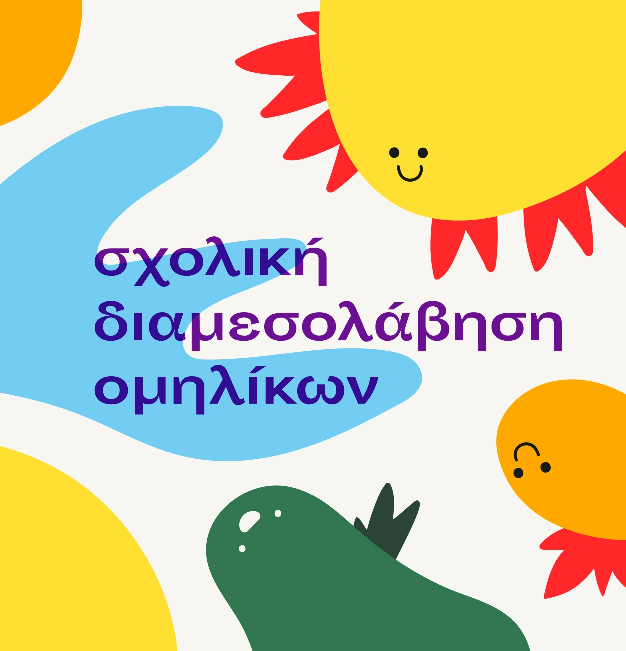
Peer Mediation at School
To support theor efforts with visual storytelling: creating illustrations and digital design assets that reflected the heart of their work.
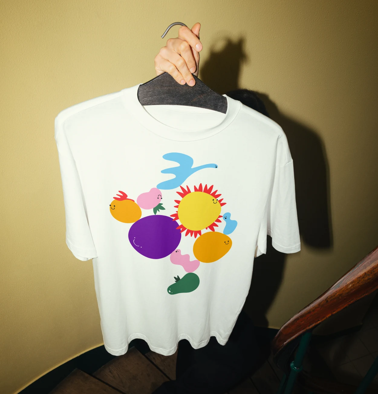
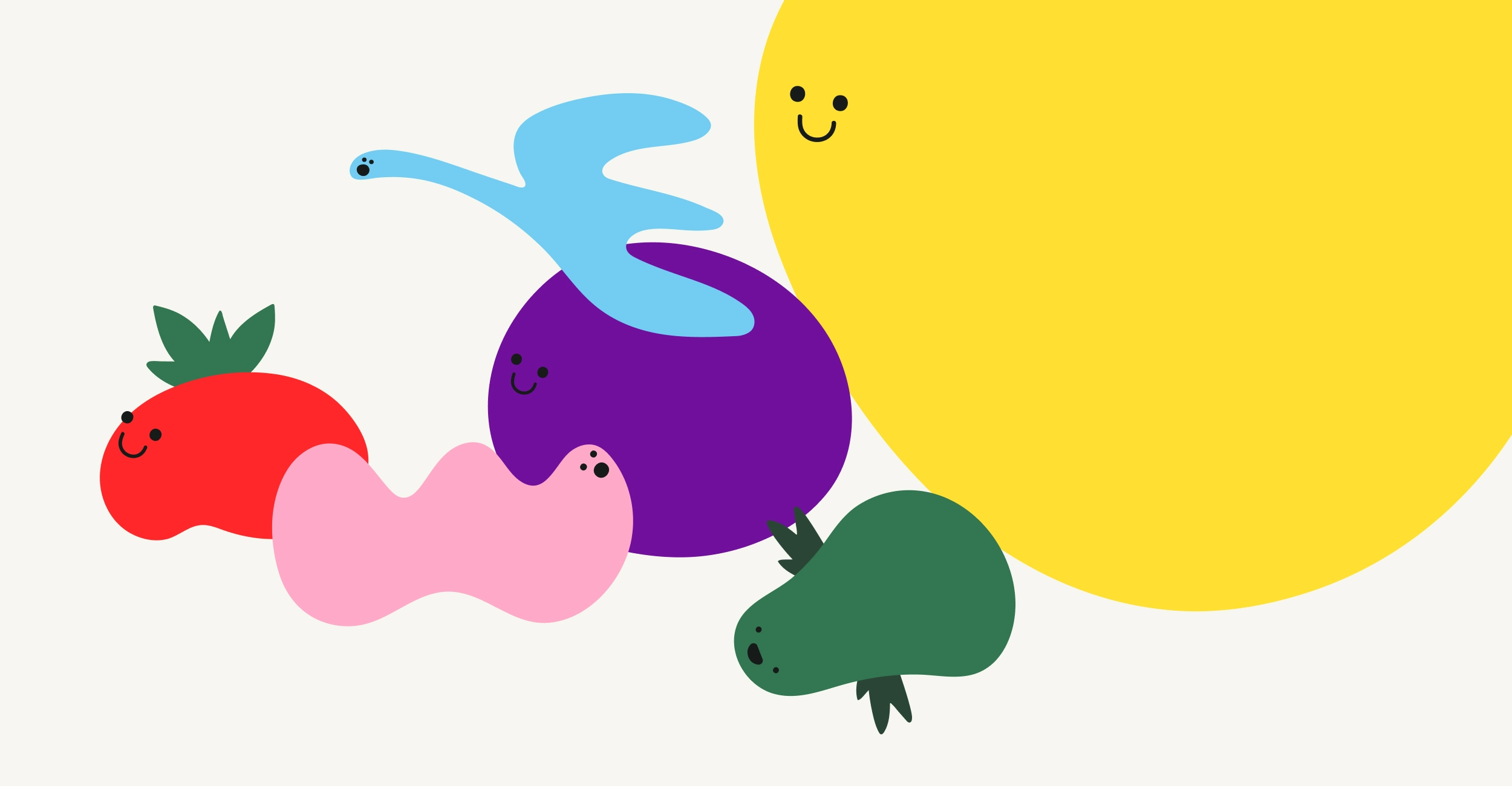
We designed a series of playful illustrations for use across social media, along with wireframes for the front face of their blog. These assets helped communicate the group’s values in a way that felt warm, inclusive, and easy to relate to, especially for educators, parents, and students.
Strengthened the initiative’s online presence with approachable, clear visuals. Provided a flexible, scalable visual system for future use. Helped translate abstract ideas into relatable imagery
Visual Identity, Illustration, Social media assets, Wireframe Design
Peer Mediation at School is a diverse team of volunteers with one thing in common: a belief that soft skills matters just as much as academic performance. They offer resources to schools, parents, and communities to help promote soft skills, especially in early education. Our task was to support this mission visually, creating a visual language that could convey ideas like balance, emotional harmony, and growth in a way that felt accessible and age-appropriate.
As the initiative’s work grew, so did its need for a more cohesive, expressive visual presence, particularly on social media and its soon-to-launch blog. They wanted illustrations that could communicate their message at a glance, even to young audiences.


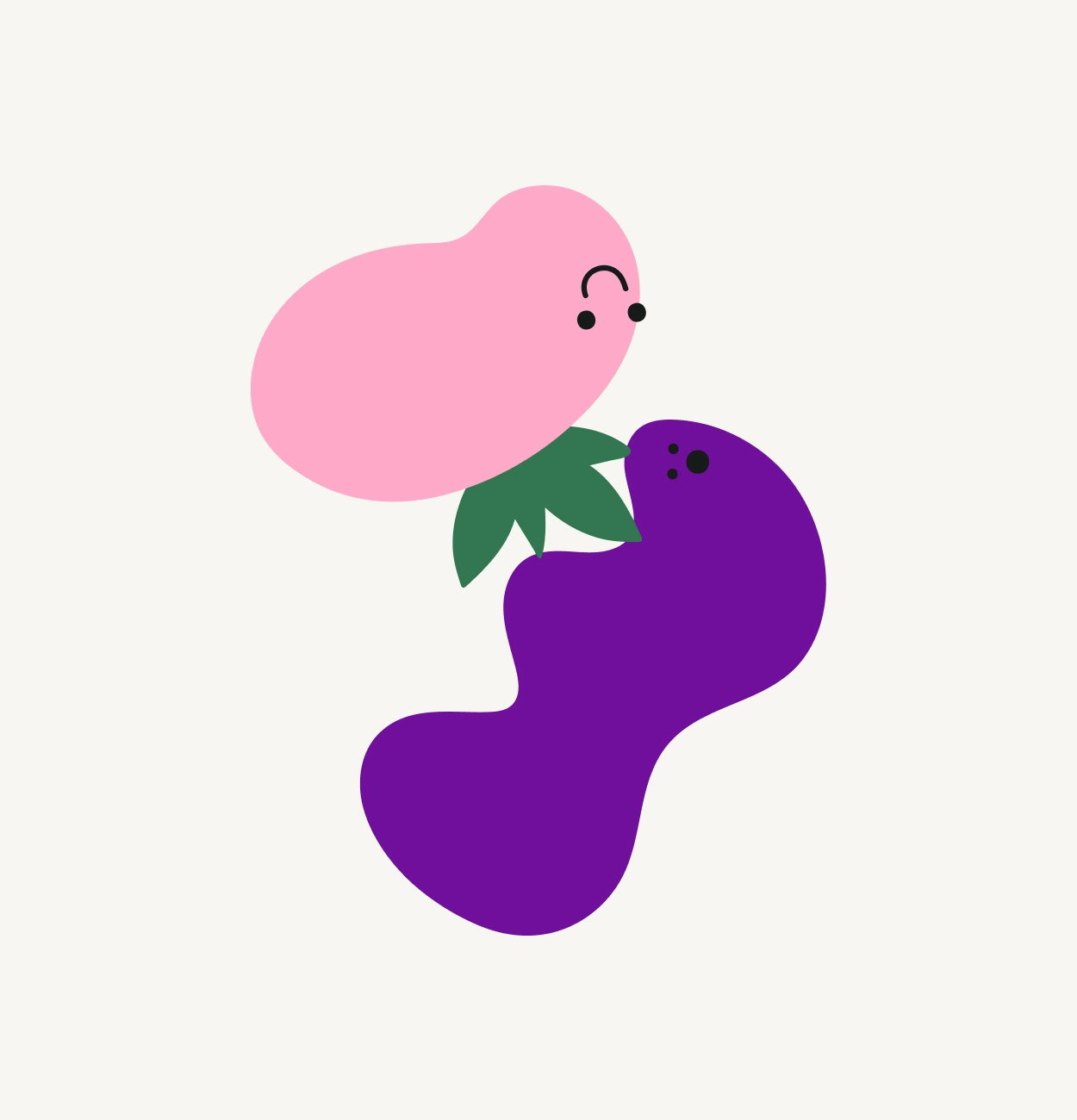


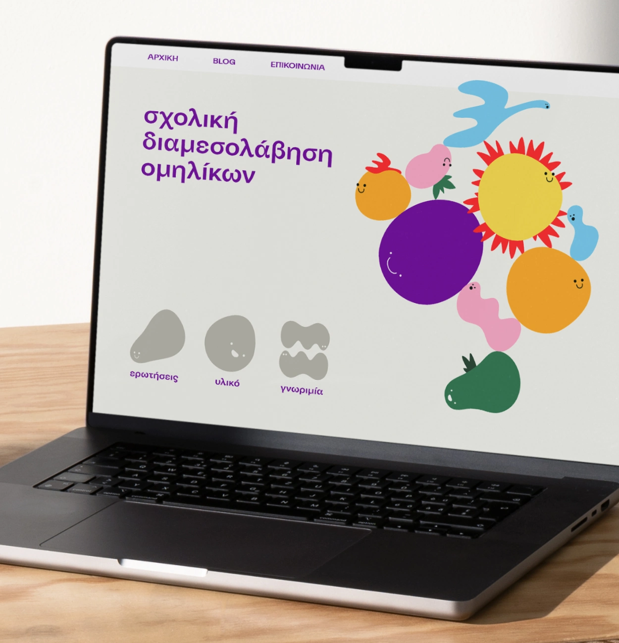
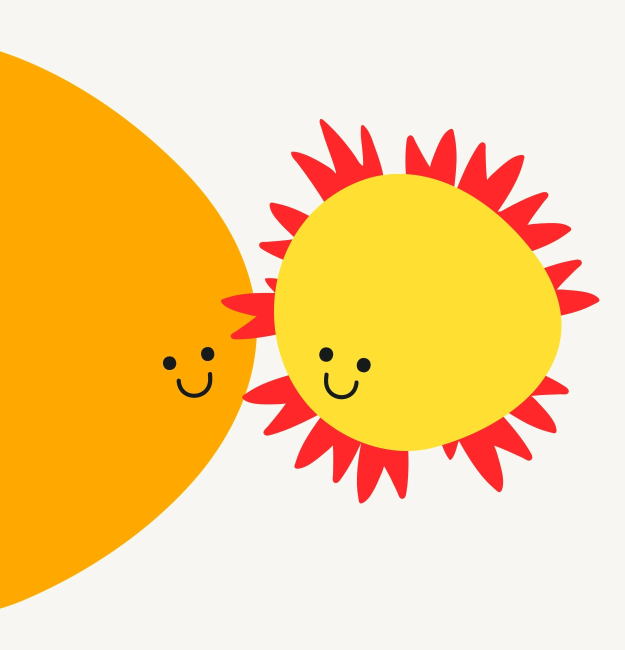
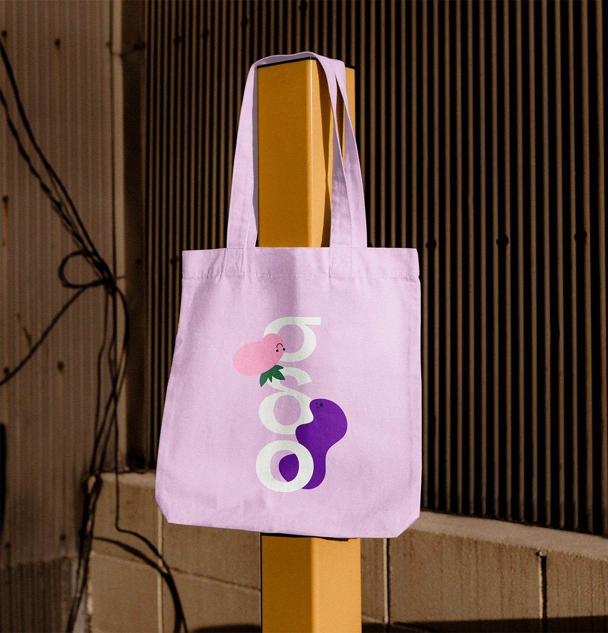
Our design process began with the idea of balance, both emotional and social. We drew inspiration from children’s physical balancing games, which mirror many of the soft skills the initiative promotes: coordination, problem-solving, cooperation, and resilience. Each character we created was shaped by this theme: simple, playful figures built from organic forms, representing different personalities and ways of thinking. We also designed basic wireframes for the front page of the blog, offering a clear, friendly layout that would be easy to manage and expand upon as the initiative grows.
We deliberately avoided overly complex visuals in favor of warmth and familiarity. We let the illustrations feel like the message, not explain it too literally. The result? A visual identity that complements the message without overpowering it. The illustrations were launched across social media and support the rollout of the organization’s blog. They’ve been used in informational posts, shared in classroom settings, and repurposed in educator workshops to help spark dialogue around soft skills and conflict resolution. By giving Peer Mediation at School a simple, expressive visual system, we helped them reach more people with warmth, clarity, and empathy.


purpose-driven
design studio
We’re a creative design studio doing branding and web design for people trying to make the world a little better.