A visual identity for ProChorao campaign that pushed for change
Not sure what Orgcaos services you need? Take the assesment
A visual identity for ProChorao campaign that pushed for change
ProChorao Campaign by Rainbow School, with support from the Council of Europe
To create a campaign identity that felt approachable, inclusive, and persuasive enough to shift public mindsets and support real policy change.
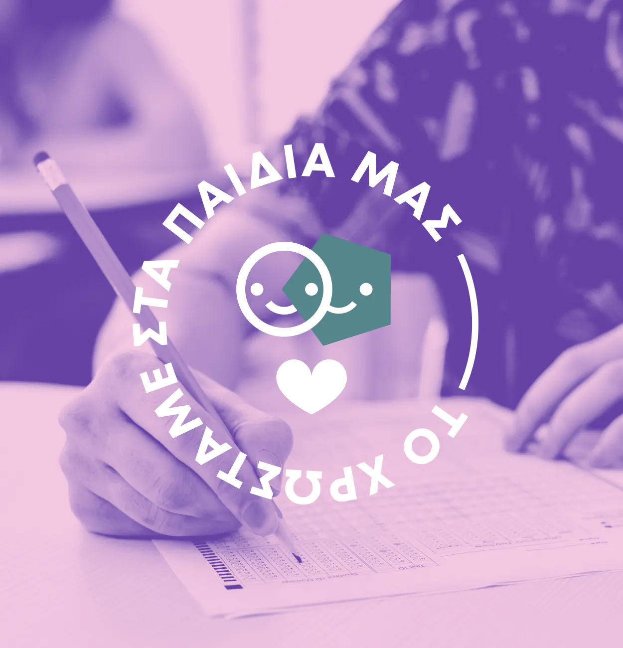
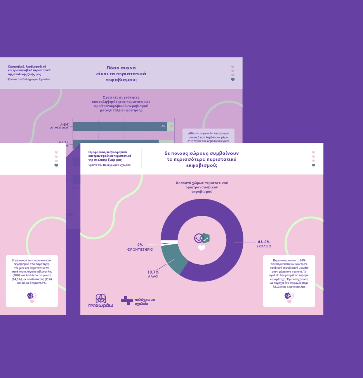
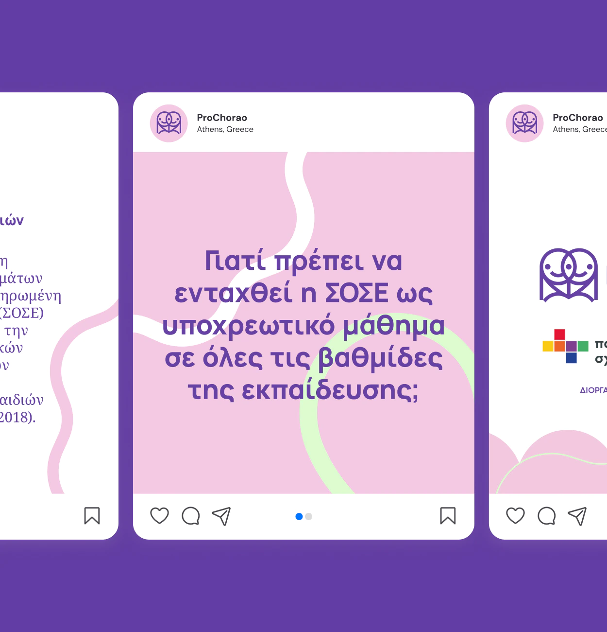
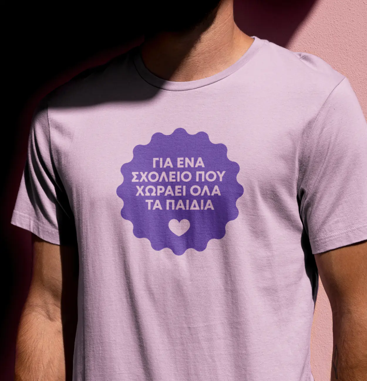
We developed the full visual identity of ProChorao: logo, illustrations, posters, social content, digital materials, and a campaign website. Every element was crafted to invite conversation, build trust, and inspire civic engagement from first graders to lawmakers.
30+ NGOs signed the open call. Thousands of individual supporters joined in. Influencers and journalists amplified the message resulting in mandatory sexual education in Greek schools. Design didn’t do it alone. But it helped.
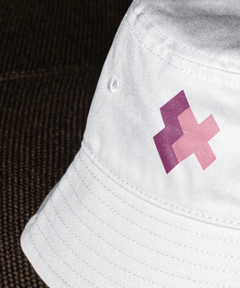
Visual Identity, Logo Design, Illustration, Print & Digital Design, Brand Style Guide, Social Media Content, UI Design, Information Design
In Greece, sexual education has long been overlooked or avoided in public education. Rainbow School NGO, with support from the Council of Europe, launched the ProChorao campaign to change that, by making Comprehensive Sexual Education (CSE) mandatory across all levels of schooling. The campaign needed to work for students, educators, parents, and policymakers alike. The identity had to strike a rare balance, feeling trustworthy, inclusive, playful, and safe.
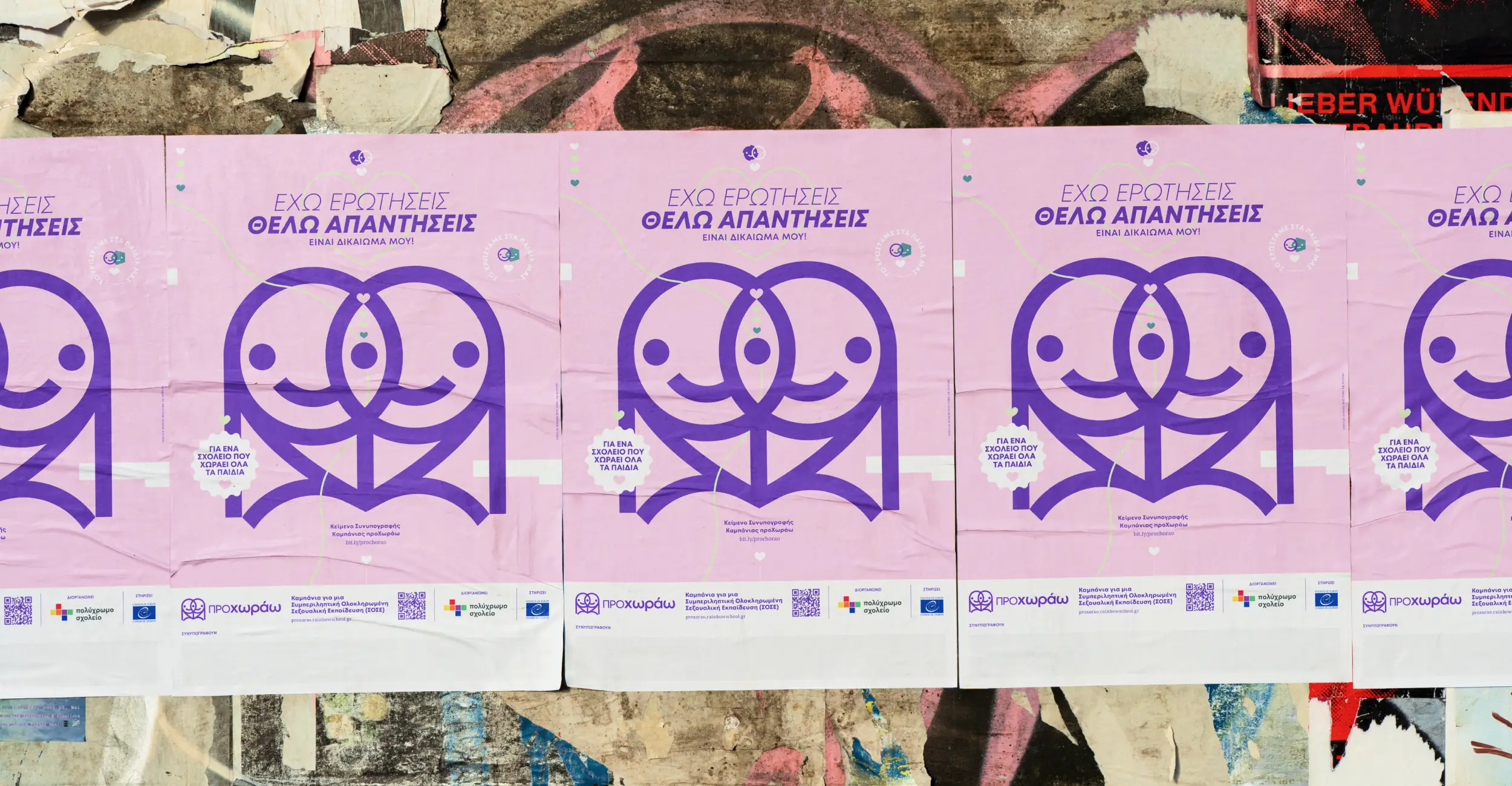
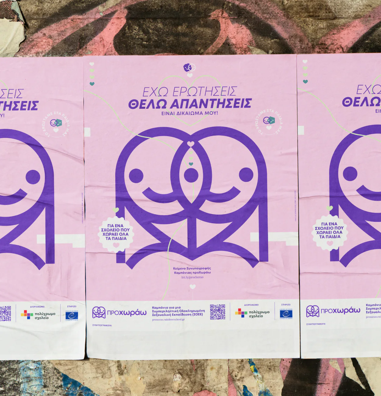
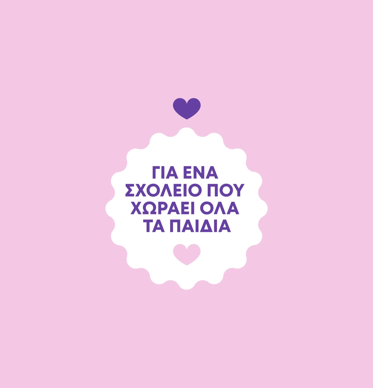
ProChorao (ΠροΧωράω) means “I move forward” and “I fit in.” That blend of meanings shaped not only the name of the campaign but the tone of everything we built. Rainbow School wanted to invite people into the conversation and not shout over them. But it also had to feel urgent. The policy window was open, and we needed to make it count.
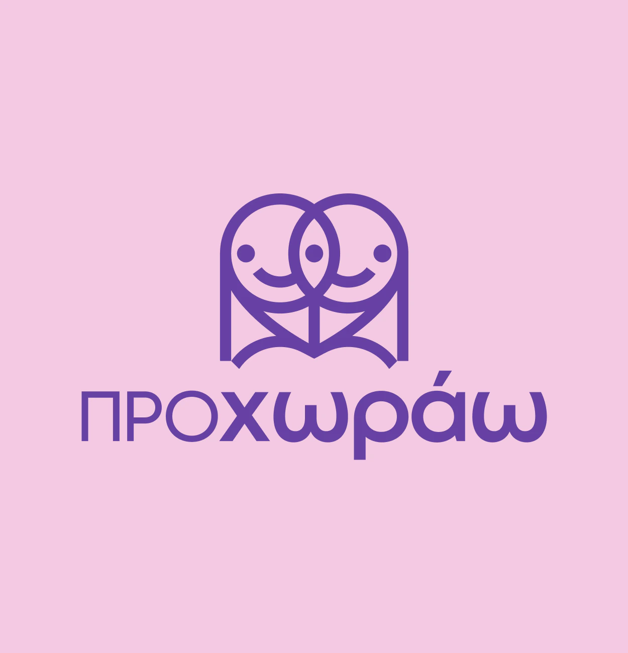


We approached the campaign by creating a visual identity that was rich in meaning yet approachable. The typography of the logo drew from the dual meaning of ProChorao. while the symbol integrated layers of metaphor: two gender-neutral figures in peaceful dialogue, a tree representing growth, a book for openness, and a heart inspired by the ancient silphium plant, known for its healing properties. These elements helped visually frame sexual education as something nurturing and empowering, not clinical or controversial. Alongside the identity, we developed custom illustrations to carry emotional weight and guide tone across mediums. Every brand application was made with the core values in mind, so the campaign could meet people where they were and invite them into the conversation.
The biggest design risk? Softening the tone. In a space where activism often leans bold, loud, and urgent (with good reason), we chose an invitational approach, especially since topics involving children can easily veer into extremes. Once the campaign launched, momentum built quickly. NGOs endorsed it. Public figures shared it. The visual identity helped give the movement a face and a presence people could get behind. The ProChorao campaign helped gather real public and institutional support and sparked enough momentum to make CSE a reality in Greek schools. We won’t claim design changed the law. But design helped more people feel like the conversation was theirs. And that’s how real change starts.


“Throughout the collaboration, Orgcaos maintained constant communication and tried hard to understand our needs. I highly recommend working with them due to their creativity and their ability to look beyond the surface.”
Board member at Rainbow School Greece
purpose-driven
design studio
We’re a creative design studio doing branding and web design for people trying to make the world a little better.