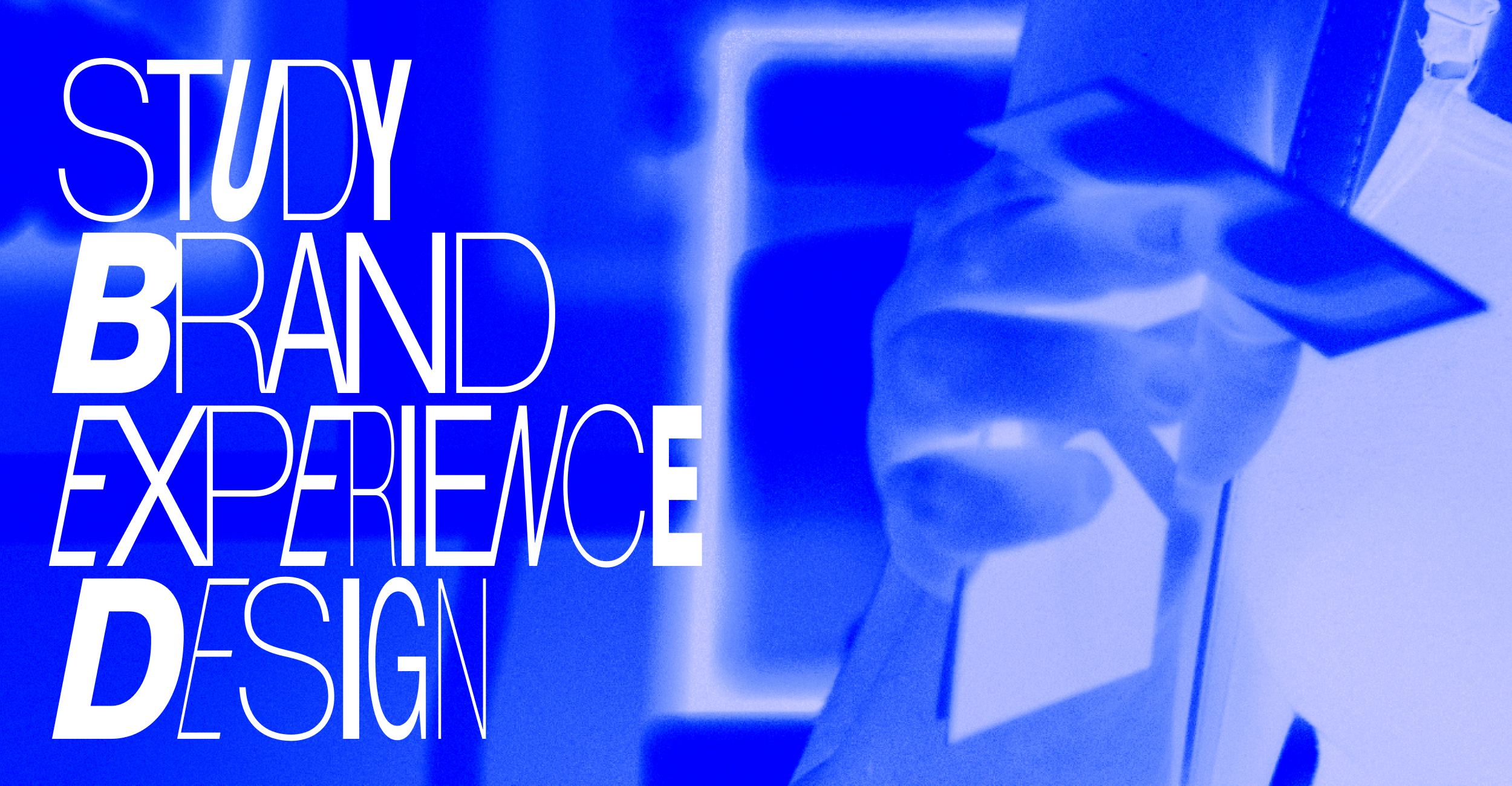
Not-so-serious branding for someone seriously creative
Not sure what Orgcaos services you need? Take the assesment
Not-so-serious branding for someone seriously creative
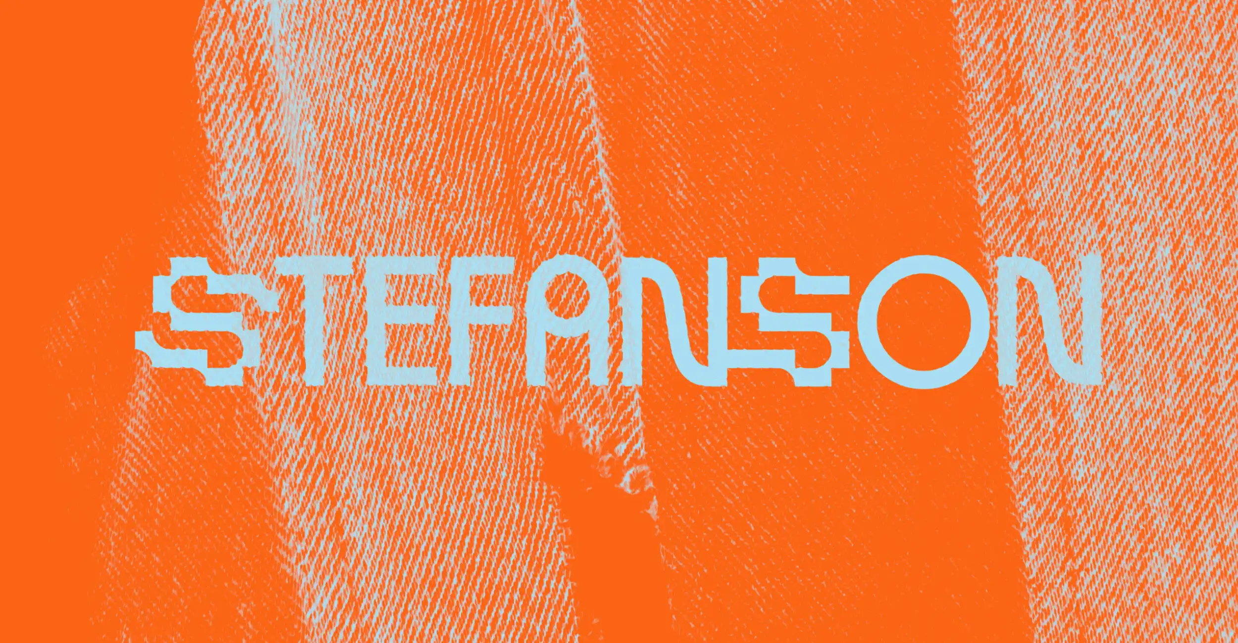
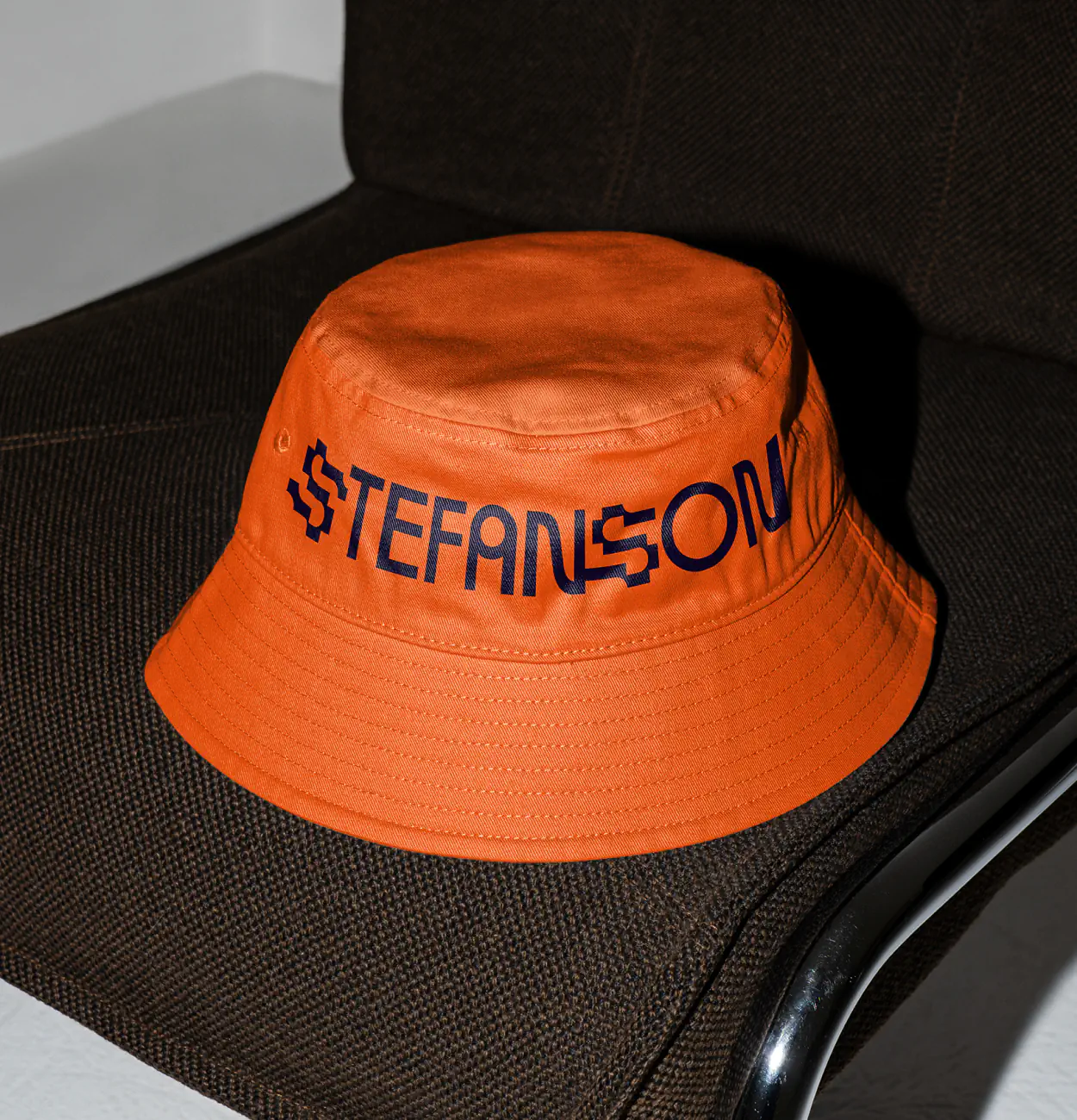
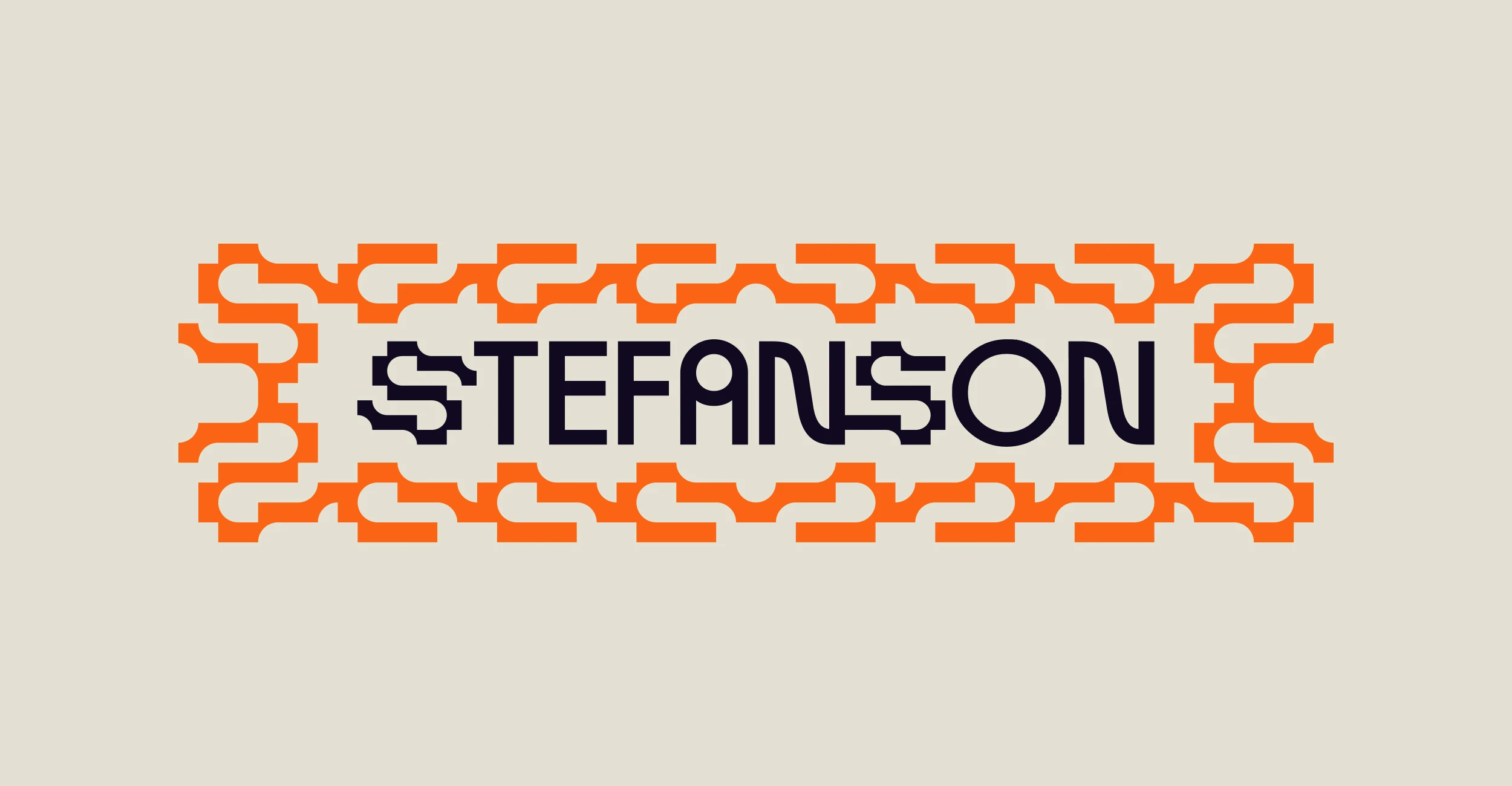
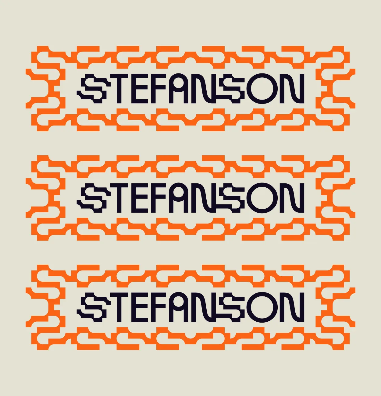
Stefanson
Create a visual identity bold enough to represent the vibrant yet authentic Stefan Degen to help him stand out in Basel’s creative market. Also, orange enough.
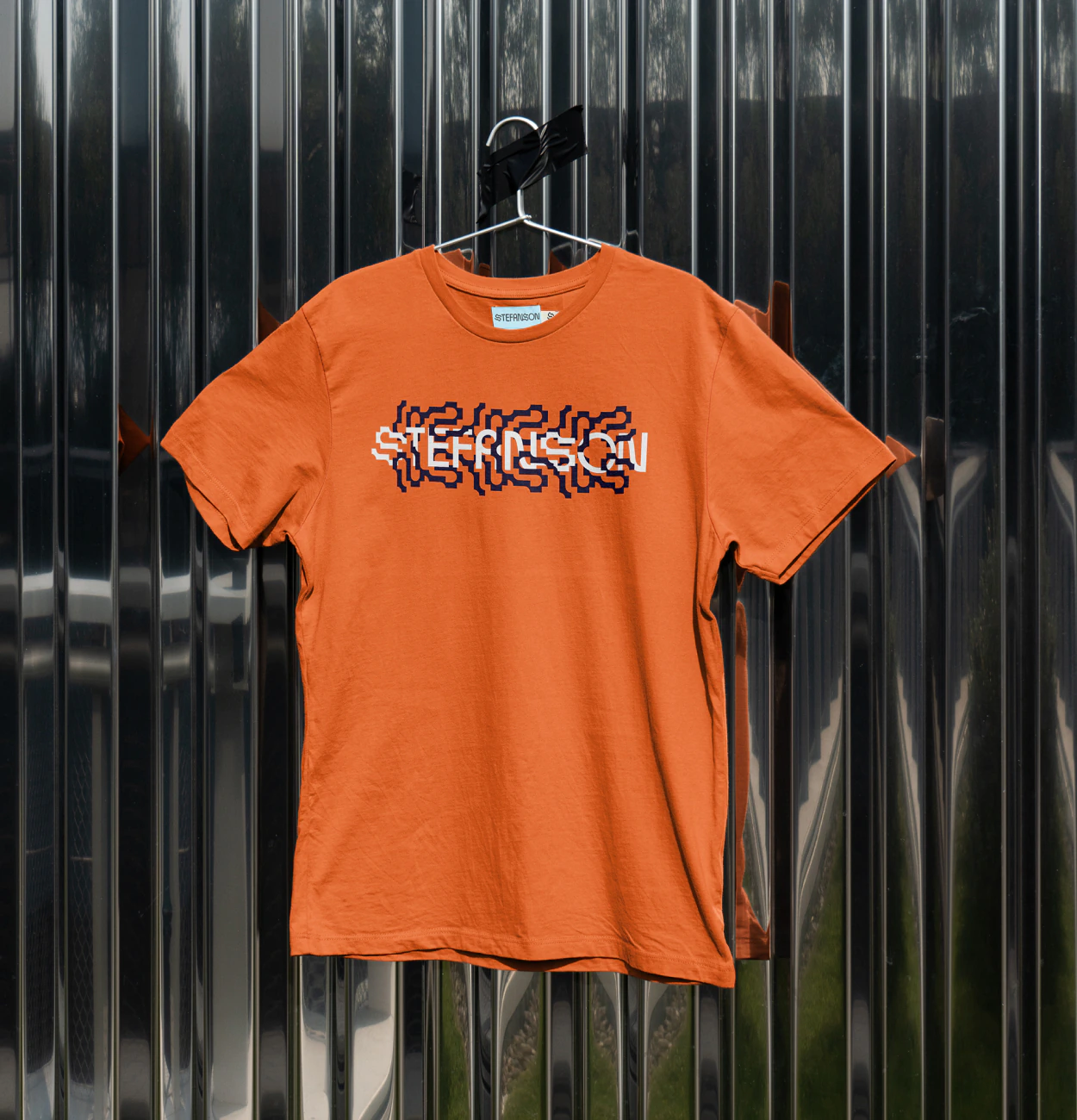
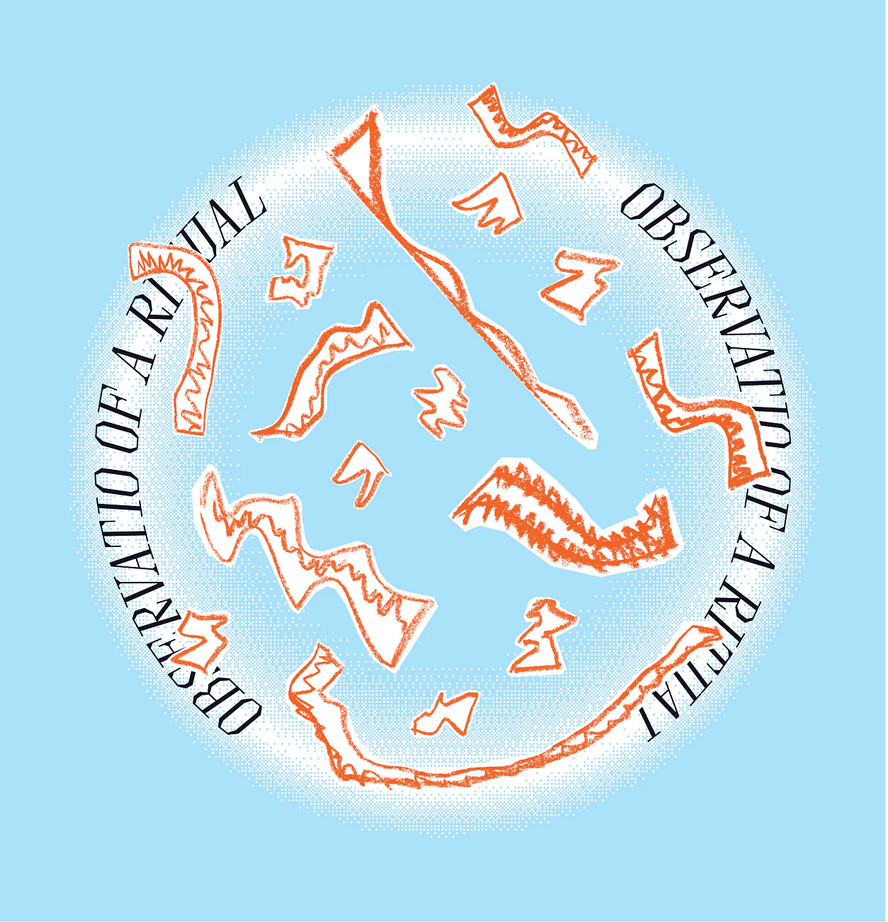
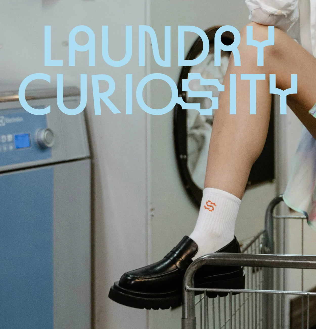
A vibrant visual identity with flow, designed to express the Stefanson brand in a dynamic, playful way. We also developed an exhibition visual identity for Stefanson’s first solo show, Laundry Curiosity.
His solo exhibition featured a complete visual system tied to the new identity. The brand became a tool for connecting Stefan’s creative practices under one memorable visual language.
Visual Identity, Logo Design, Print Design, Poster Design, Brand Applications, Brand Style Guide
Stefan Degen is one of those people who never quite fits in one box, and wouldn’t want to anyway. He moves between DJing, tattooing, art direction, cultural projects, fashion, and textile art (sometimes all in one week). When he decided to unify these under his new creative name, Stefanson, we were brought in to create a visual identity that could hold it all. The goal? A brand that felt vibrant and curious, like Stefan himself. It also had to be orange.
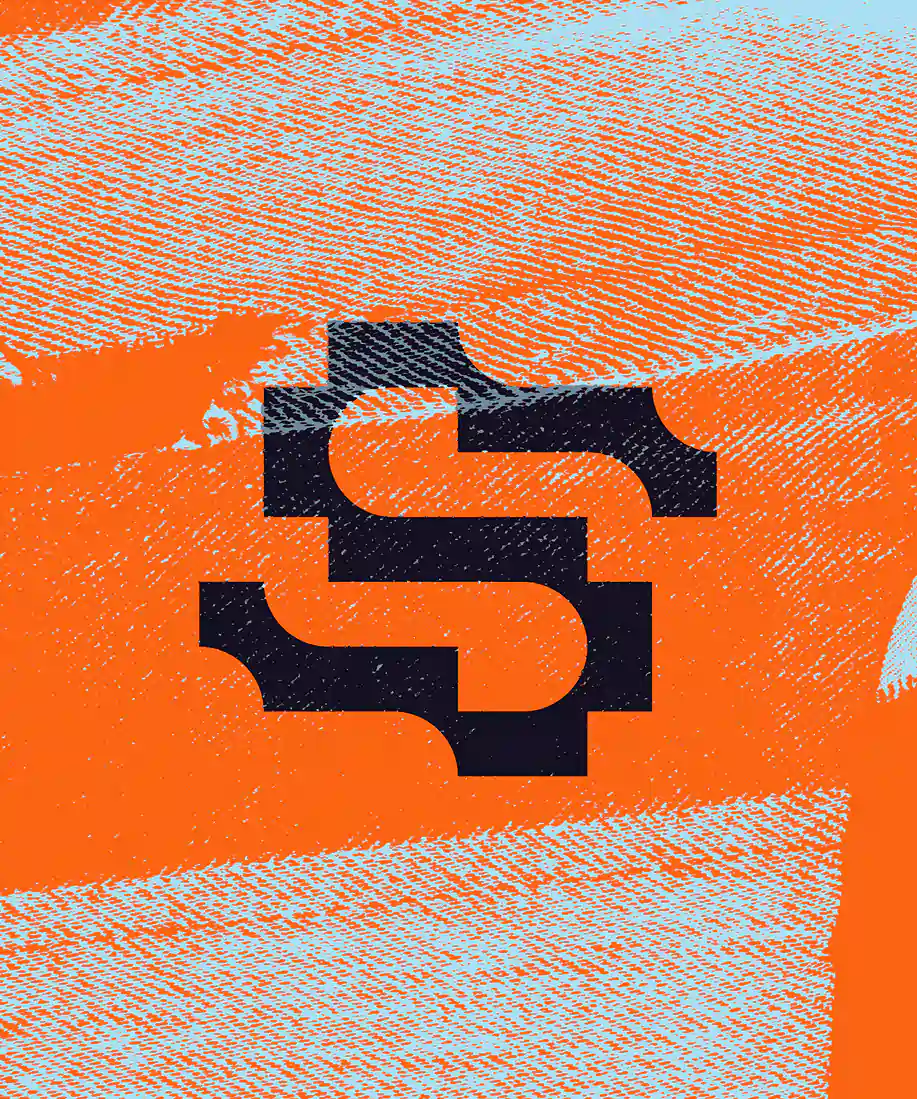
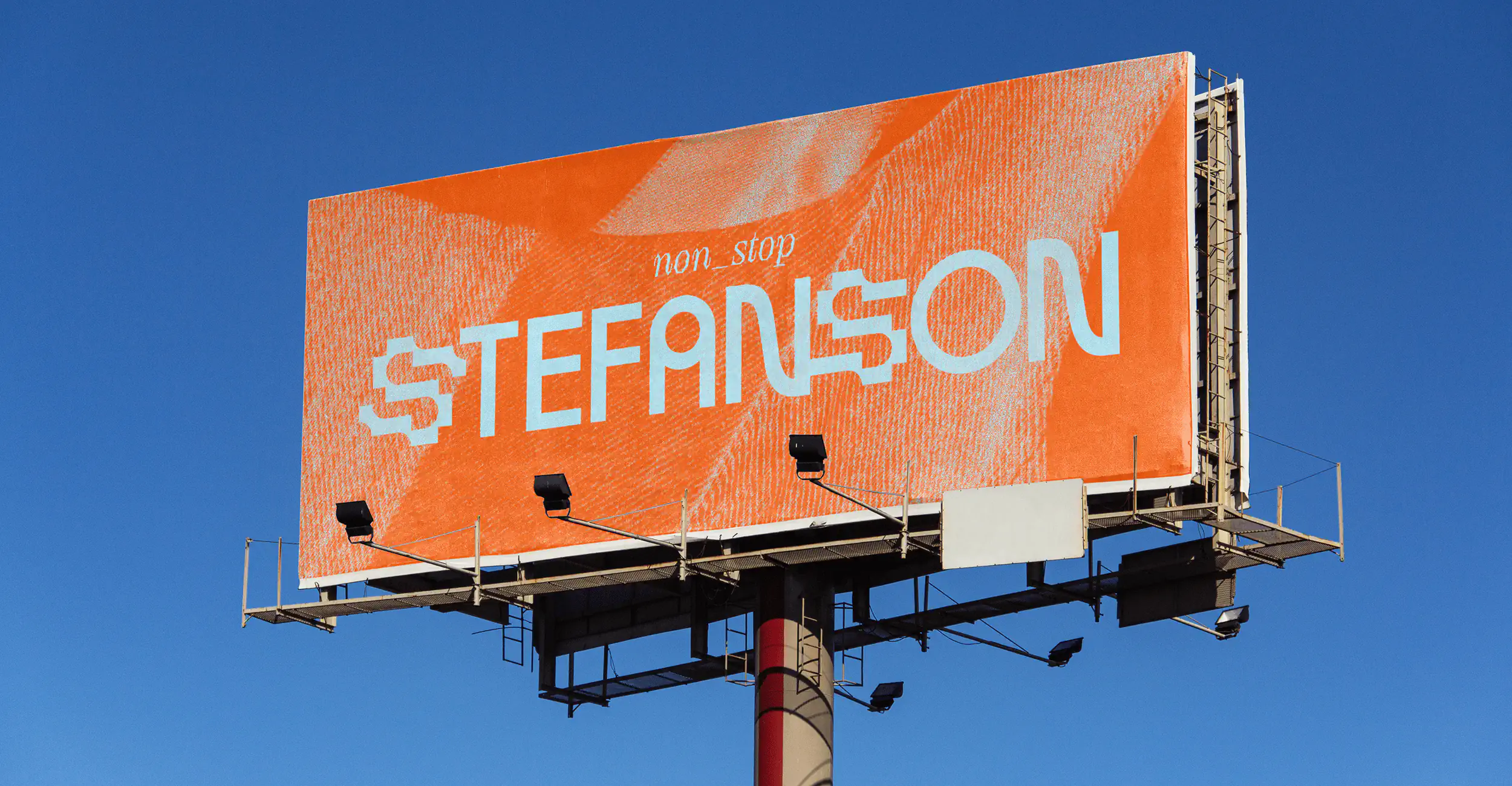
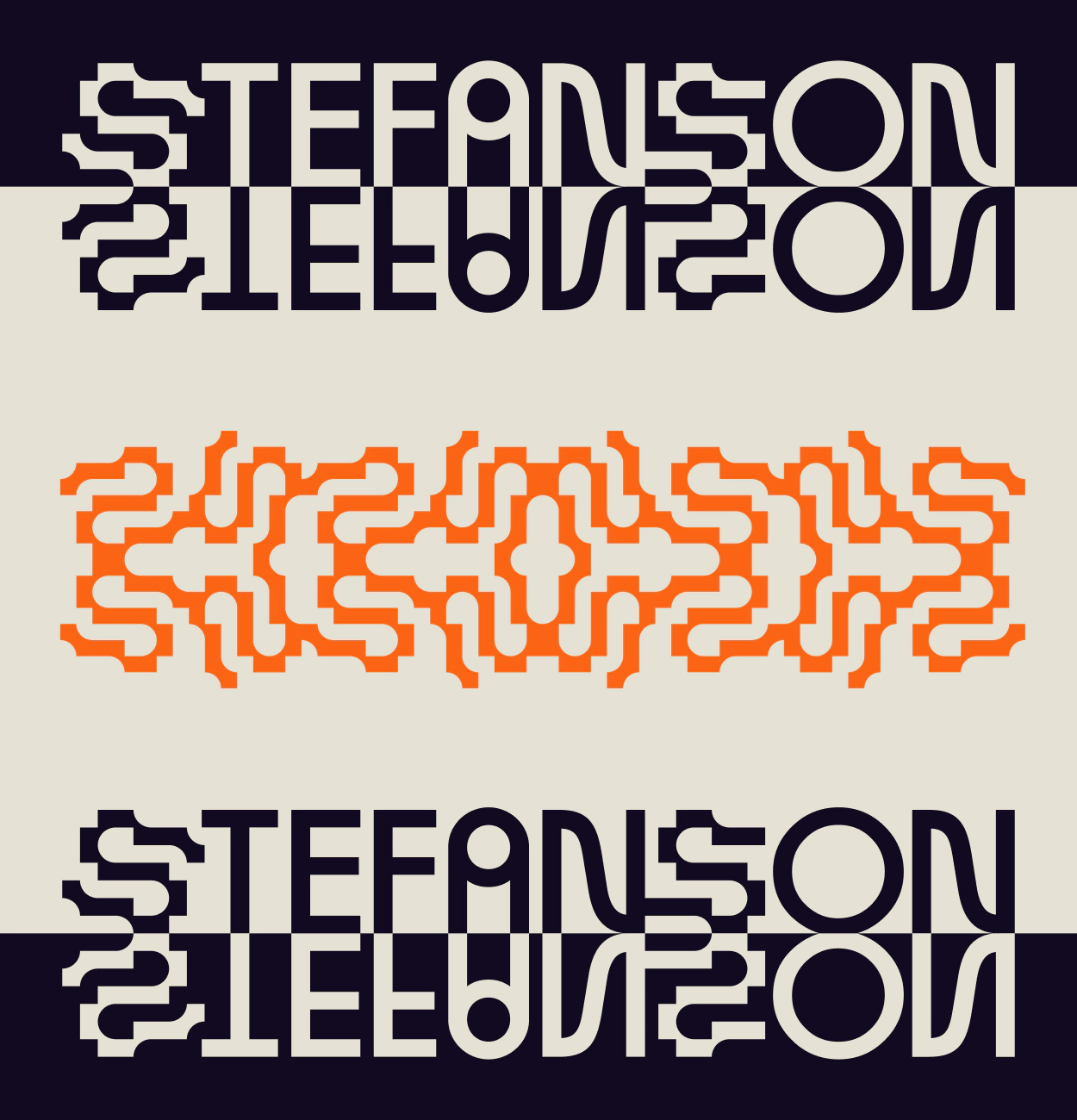
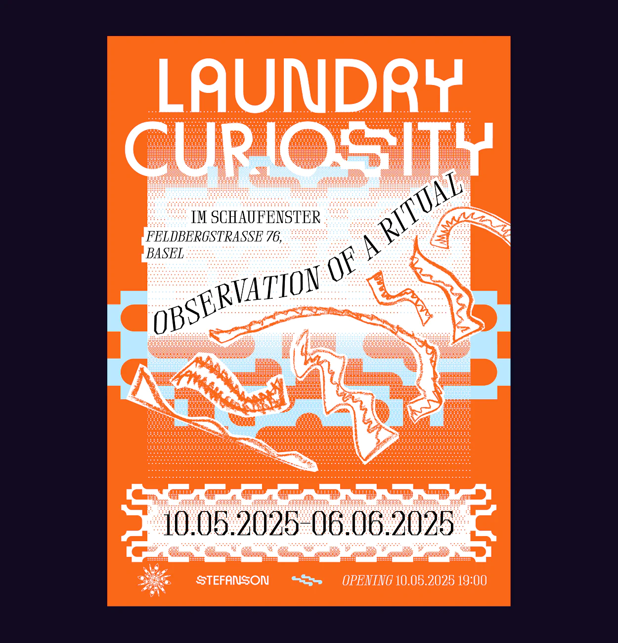
The turning point came with Laundry Curiosity, his first solo exhibition. It marked the start of something new, where Stefanson’s personality needed a cohesive thread. In our early sessions, we talked about systems built from small parts: tiny stitches forming a tufted rug, individual tracks shaping a DJ set, communities built person by person. Stefan also wanted a monogram, a shape that could morph into patterns and evolve over time.
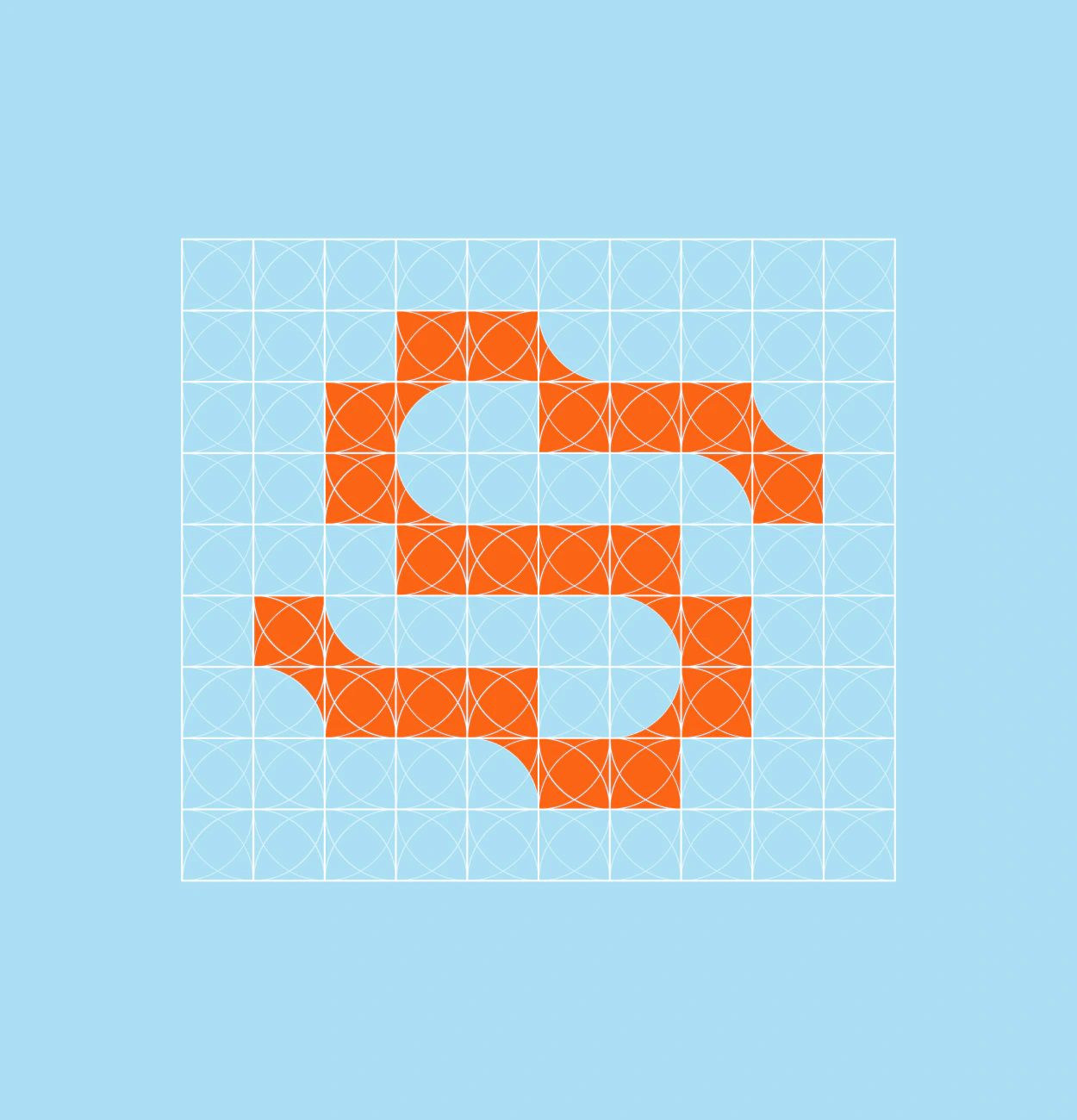

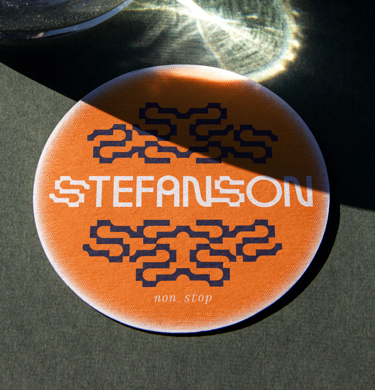
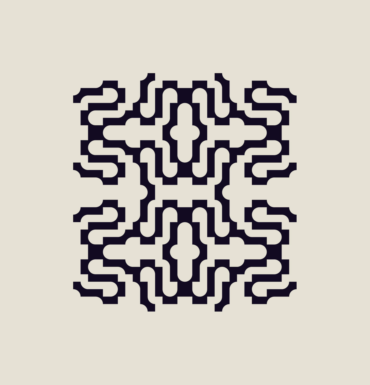
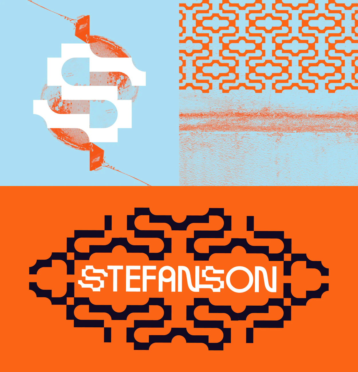
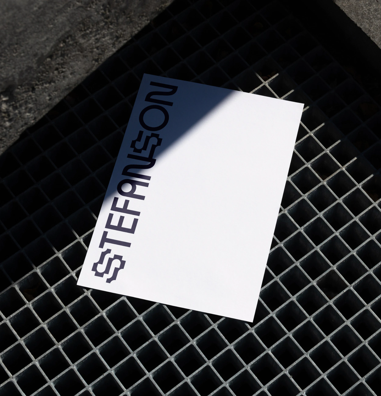
The identity centers on a symbol built from a half-circle carved from a square, forming a soft-yet-structured “S.” It’s simple, flexible, and just abstract enough to feel like a visual echo of Stefanson’s work. The logotype incorporates the monogram in combination with geometric characters. The palette combines bold tangerine with a calm sky blue, anchored by near-black and warm beige neutrals.
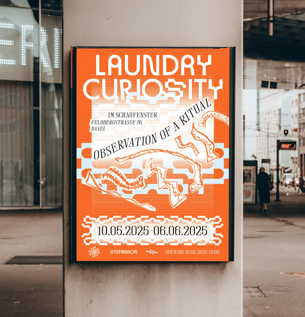
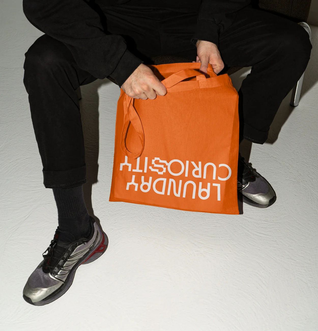
When Laundry Curiosity rolled out, the identity followed. We used sketches from Stefan’s process as visual elements, turning the posters as part of the exhibition’s ritual; raw, and mid-motion, like laundry on the line. The result is a brand that can stretch, remix, and evolve, just like Stefanson. It connects his creative worlds under one visual voice and gives him space to keep expanding without losing his sense of self.


"With Orgcaos, I never felt left alone in that process. They guided me through the projects without overcomplicating things, asked the right questions, and helped turn vague ideas into clear results."
Creative Project Manager and Artist
Base shapes derived from Stefan Degen's paper sketches
purpose-driven
design studio
We’re a creative design studio doing branding and web design for people trying to make the world a little better.